
Navigation: Building Your Apps & Site Menu
The navigation menu controls which pages appear in your website and apps' main menu. Each menu item can show content from one of your categories, open a built-in page like Channels or Give, or link somewhere else. Go to Platform → Navigation to build it.
Before you start: your menu is built from your categories, so set up your category structure first. Learn more: Building Your Category Tree
In this article:
- Add a menu item: label, type, category or link, and icons
- Menu item types: category layouts, content pages, and other types
- Advanced settings: TV visibility, Continue Watching, and talent rows
- Reorder and save: menu order, icon color, and saving
- Bottom navigation menu: the tab bar in your mobile apps
- Search, user settings & copyright: where to find these settings
- Tips: preview layouts and more
Add a menu item
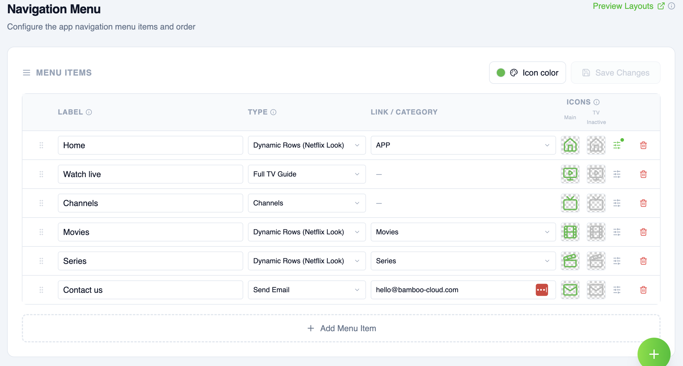
Click Add Menu Item and fill in its card:
- Label: the name shown in the menu. Changing it doesn't change the category or page.
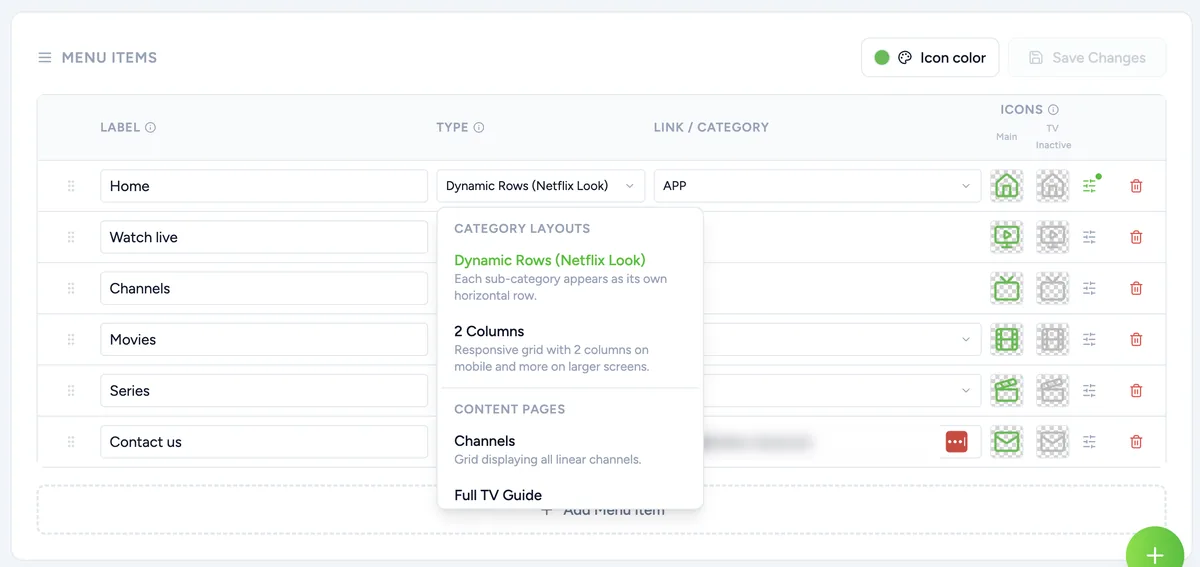
- Type: what the item opens. The list has three sections: Category Layouts show content from a category, Content Pages open built-in pages like Channels or My List & History, and Other opens web pages, email, the Bible reader or Give. See Menu item types.
- Category: for category layouts, the category to show.
- URL or email: for web pages and Send Email, the full address, including https://, or the email address.
- Icons: Main is used in the mobile apps and for the selected item on TV. TV Inactive is used for unselected items on TV, and is required when you have TV apps. Icons show in the apps only, not on the website. Recommended size: 48 × 48.
Menu item types
Category layouts
- Dynamic Rows (Netflix Look): each sub-category appears as its own horizontal row. How each row looks is set by that category's view type. This is the recommended layout for most homepages. Learn more: Advanced View Types Tutorial
- 2 Columns: a responsive grid of sub-categories or videos: 2 columns on mobile, 3 on tablet, and 4 on desktop and TV. On the website, the page can also show the category's cover banner.
Content pages
- Channels: a grid of all your channels.
- Full TV Guide: a video player with the full program schedule for all your channels. Learn more: Live TV
- My Purchases: the viewer's purchases, with expiration timers and quick links to watch.
- My List & History: the viewer's saved items and recently watched content.
Other
- In-App Web Page: opens a web page inside your website and mobile apps. Not supported in TV apps. Enter the full URL.
- External Web Page: opens a web page in the device's browser. Enter the full URL, including https://.
- Send Email: opens the viewer's email app with your address already filled in. Enter the email address.
- Bible: a Bible reader in your colors. Viewers choose the translation: KJV, BSB, or WEB.
- Give: opens your Stripe giving page. Set it up first in Monetization → Giving. Learn more: Giving
Advanced settings
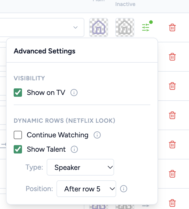
Click the Advanced settings icon (sliders) on a menu item's row:
- Show on TV: turn it off to hide this menu item in your TV apps.
- Continue Watching: adds a Continue Watching row to the page, with videos the viewer started but didn't finish. Dynamic Rows (Netflix Look) only.
- Show Talent: adds a row of your speakers, cast, or artists to the page. Choose the Type to show, and a Position: Top of page, or After row 1 through After row 10. Dynamic Rows (Netflix Look) only. Learn more: Talent
About the Talent row position:
- A new Talent row starts After row 2.
- If the page has fewer rows than the position you chose, the Talent row shows at the end of the page.
- If Continue Watching is also on, it shows right after the Talent row.
- The position applies on your website and in your iOS and Apple TV apps.
- The first menu item is usually your home page, so its setting places the Talent row on your home page.
Click Save Changes when you're done.
Reorder and save
- Reorder Items: change the order of your menu items. They appear in the menu in this order, and the first item is usually your homepage.
- Icon color: the color of your menu icons.
- Remove: click the trash icon on an item to remove it from the menu.
- Save Changes: your changes go live after you save.
Bottom navigation menu
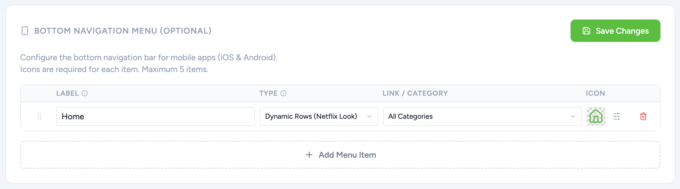
Optional. Add a tab bar to the bottom of your mobile apps (iOS and Android). Click Add Menu Item under Bottom Navigation Menu and set it up like your main menu. You can add up to 5 items, and each one needs an icon. Click Save Changes in that section when you're done.
Search, user settings & copyright
Whether search and user settings show in your menu, and your copyright text, are set in Platform → General, because they apply to your website and apps. Learn more: General Settings
Tips
- Click Preview Layouts at the top of the page to see examples of every layout and view type.
- Category layouts need a category, so create your categories before adding menu items.
- Check your website and apps after saving to see your menu in action.
Learn more: Create & Edit Categories · Setting Up Your Home Screen · Advanced View Types Tutorial